


This board contains several examples of my work in layout design and typography. It shows my work in book and cover design, as well as poster design, my work with different typefaces, and my skills in making layouts that correspond well with their subject matters.

These photos are some examples of freelance work that I do for Jewell Photo, where I create photo borders for them to use at different events.

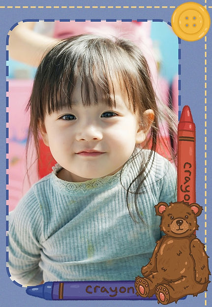
Preschool class photo border, all elements drawn by me (Photo by CDC on Unsplash)
Variations of the preschool class photo border, made into bag tags and bookmarks for individual photos of each child (Photo by 东旭 王 on Unsplash)


Photo border for a Barbie themed daddy daughter dance, daddy daughter font handmade by me (Photo by master1305 on Freepik)

The final recolor of the daddy daughter border, as their backdrop ended up being pink, so they wanted variation in the color pallet so it wasn't all just pink (Photo by Freepik)

Rob Roy Kelly American Wood Type Collection: A History and Catalog by David Shields Book Review cover images

Rob Roy Kelly American Wood Type Collection: A History and Catalog by David Shields Book Review cover images

The inside cover and first page of my book review

Page two and three of my book review

Page four and the back inside cover of my book review

Clairo's Sling North American Tour Poster

Clairo's Sling North American Tour Poster Mockup

Layout design of Clairo poster mockups

Hacked Typeface, using Baskerville and filling every letter with miniature flowers
.jpg)
Hacked Typeface arranged to spell "Bloom"

A mockup of the cover of my Detroit Murals book

A mockup of the table of contents of my Detroit Murals book

A mockup of the spread of pages one and two in my Detroit Murals book

A mockup of the spread of pages 15 and 16 in my Detroit Murals book

A mockup of the spread of pages 25 and 26 in my Detroit Murals book
This case study explores my cover design for the book "Animal Farm." In this case study we will look at my illustration, as well as the books layout design, and how this design properly conveys the story that "Animal Farm" tells.
For this illustration, I wanted to focus on the the main theme of propaganda while still making the illustration a bit cutesy. I feel like that's the overall feel of Animal Farm and I wanted to convey that feeling through my design. Thats why I used pastel colors and made my design elements look plush and inviting, while still feeling a bit menacing.


This project explored the idea of a world where emotions are not allowed. I like to sometimes call it the "Glass Half" project because each piece can be looked at from two completely different perspectives. Whether that be from an optimistic or pessimistic view, or through examining the way ads are catered towards our emotions, rather than telling us the truth, or even the way mental health is discussed in situations where it may be taboo.

A poster for McDonald's where the emotionless, factual poster is intertwined with the colorful, fun poster that caters to the viewer's emotions


Each poster separately before combining them

The front of a brochure expressing how it is unacceptable to feel emotions, and what to do if you're feeling them

The inside of that same brochure, filled with pieces of my memories and things that make me feel, asking if everything is ok


The final pieces at my senior exhibition